Veggie Buddy app

PROJECT OVERVIEW
CHALLENGE
Design a new wellness app to help improve a user’s nutritional intake to consume more whole foods.
SOLUTION
-
Design a new app that improves a user’s ability to make daily changes to their eating and health habits through the integration of an AI Nutrition Coach and a reminder schedule.
-
Integrate scheduling and calendar functionality into the nutrition app
GOALS
-
User feels catered to
-
Gives goals & rewards
-
Guides user to success
-
Simple & Informative
-
Shows progress through time
ROLE
UX / UI Designer
TIME
7 months
TASK
Design an app concept that helps users improve nutrition
TOOLS
Figma, Photoshop, Illustrator
WHO - WHAT - WHY
I worked with a team of 3 other researchers to interview users about their challenges surrounding nutrition intake. We learned by interviewing various users that the main challenges came from lack of time, monetary restriction, and inability to adhere to routine. I chose to create an app that would tackle the latter issue. After working as a team to complete the research phase we broke off to create individual app designs that would attempt to solve the challenge of improving nutritional intake.
RESEARCH > DEFINE > DESIGN > TEST > REDESIGN > PROTOTYPE
MY PROCESS
RESEARCH
USER INTERVIEWS
In order to learn about the experiences people have while adjusting health habits, I spoke with 4 participants for user interviews.
A recent
college graduate
A new mother
A couple
in their 60's
A young
healthcare worker
I focused on asking open-ended questions about their experiences to learn about users wishes, frustrations and goals surrounding their wellness jouneys. I found people struggle with time management and sticking to goals.
Users had a hard time sticking to ideal personalized nutrition due to time, money restrictions, and convenience.
Users knew what they could do to improve their ideal nutrition but were unable to actualize habit improvement.
Achieving their goals for ideal nutrition should be tied to personal health versus perceived societal health standards.
COMPETITIVE ANALYSIS
To gain a better understanding of the market trends, demographics, and what my user was voting for, I researched popular wellness apps.
FINDINGS
-
Users value an app that creates long term results through habit and behavior change, not restrictive dieting.
-
Apps that tracks diet and exercise using gamification elements to encourage adherence to exercise and diet goals work well.
-
Users will choose a wellness app that combines many elements, such as one with a log that tracks the number and quality of calories, encourages healthy eating, and provides tips and information about nutrition.

FOODUCATE
MY FITNESS PAL


NOOM
OPPORTUNITY FOR IMPROVEMENT
Integrating the scheduling and calendar functionality into the nutrition app.
An app that pinged the user with reminders and kept track of their successes in coordination with a calendar would be a fast and direct route to their success.
I found that many apps were mainly logs and entry tools, where the user had to do a lot of extra work to stay up to date with app engagement. I wanted a system where the user would naturally be redirected to the app and it would be integrated into their every day functionality with their phone, similar to calendar reminders for events and message notifications.
INTENTION
Compiling all the research I had done thus far, I set an intention for how to solve for the original challenge.
Veggie Buddy will be an accountability app concept that uses notifications and an artificial intelligence chat feature to help the user create and improve overall nutrition habits. The app’s scheduling and reminding features serve as a buddy to keep the user on track with their goals and lead them toward success. Users need friendly nudges from external sources to be reminded of their goals and a personalized time management system to see real change.
DEFINE
USER FLOW
I focused on the onboarding flow becuase I predicted if users agreed to reminders, notifications, and watch pairing early on they would be reminded to stick to their goals and review their personailzed nutrition goal calendar more often.


SITEMAP
The layout of the pages should all lead back to the calendar and achievements page as the central hub, so time management and scheduling remains the focus. The achievements page is set up to be directly adjacent to the home page so the user can see their progress over time and get the satisfaction of the reward and gamification element.

DESIGN
SKETCH
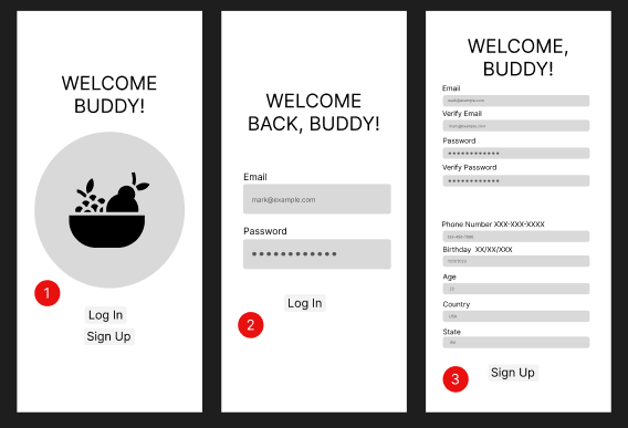
I drew screens that looked recognizable to the user, similar to features that might be used often in other applications, easy to quickly adapt to and focus on scheduling & reminder set-up.

LOW-FI DESIGNS
PAGES
I designed screens that would lead the user through onboarding to explain the benefit of setting up reminders initially, so the user could sit back and let the time managment system do most of the work. If they needed additional help, they could utilize the chat feature, look for recipe ideas or find nearby markets all in one place.


TEST
USEABILITY TESTING
The app should do most of the heavy lifting for the user, so they can make small adjustments to their schedules and daily/weekly reminders as they learn what will help them the most.
-
What areas made them pause, and what was confusing?
-
Is having the onboarding be so detailed really necessary to the main goal of improving scheduling and integrating reminders?


I conducted in person testing with four users. They gave positive feedback overall, but there were pages that resulted in repeated difficulties. Information and onboarding screens were hard to navigate, a clear indication of the homepage was needed. Despite what I had projected, a thorough onboarding process may not be necessary to succesful scheduling in the calendar portion.
MID-FI DESIGNS
PAGES
Compiling all the information I had worked on thus far I started on improved, high fidelity wireframes and an updated prototype. With Veggie Buddy’s design theme defined, I worked on incorporating a more polished and fully actualized app design.


COMPONENTS
I designed a carrot icon to incorporate the theme of nutrition, and created a friendly looking color pallete to flush out the brand design. I chose a font that felt trustworthy but also appeared upscale and was easily readable.


MOODBOARDS
I created two moodboards to showcase different themes for the app. One was meant to give a bright and fresh feel to energize the user and inspire them to think of fresh foods. The other was meant to soothe the user and give them a sense of peace, as nutrition and health can be a stressful and sensitive topic for many people.


BRAND DESIGN
The theme I chose was a combination of both moodboards to give the user a sense of freshness and also elements of calm. I chose colors for a friendly, modern and appealing feel, and chose a font that would give a sense of authority and trust.

NEXT STEPS
1. RE-TEST - While the users were able to click through it fairly easily and understand the flow, I would like to improve any roadblocks. I would like test my design again with more users of varying age and backgrounds.
2. HAND-OFF - When the design is finalized and smooth, I would send to developers to work on making the app an actualized product.
3. ADD FEATURES - After the first version of the app has launched, I would make updates and improvements based on customer response.
